Recently, there was a shakeup inside Apple’s iOS software development group. Scott Forestall, its leader left Apple and industry watchers connected his departure with Jonathan Ive’s displeasure of Scott’s use of user interface elements such as leather, stitching and other adornments that mimicked historical objects in Calendar, Contacts and other Apple software.
Skeuomorphism is the use of iconic representations from the physical world to connect digital functions and details to what is familiar to users. For example, Apple used leather and stitching for their Calendar application, or the use of drop shadows for a curved page and multiple pages to represent dimension for contacts or for books. It is here that many users have been vocal about these faux details that seem to look backward and in the end make these software applications look quaint and kitchy.
This issue came into focus when Microsoft released Windows 8 using a more graphic and flat user interface language called “Metro”. If one compares Metro to Apple, there is a stark contrast between the two and Apple’s visual language looks dated and even quaint – especially in context to the industrial design of Apple products which are sleek and minimal:
” . . . Apple veterans, and industry insiders hostile towards Apple’s approach to software design. Equally eye opening was the number who genuinely praise Microsoft for its novel approach for Windows 8, the most radical redesign to date of the world’s most ubiquitous operating system. The criticism and controversy, much of it revolving around a trend called skeuomorphism, reveal chinks in Apple’s armor rarely visible to those outside One Infinite Loop.” Source
What I find intriguing is that even Metro uses iconic representations of extinct analog objects buried in its colored tiles. The industries use of visual metaphors is nothing new. Steve Jobs visited Xerox Parc in the late 1970s to see their Graphical User Interface. Xerox used windows, icons, and menus (including the first fixed drop-down menu) to support commands such as opening files, deleting files, moving files, etc. In 1975, Xerox engineers demonstrated a Graphical User Interface including icons and the first use of pop-up menus.
The first metaphor Xerox used was the term desktop to compare a computer screen to someone’s actual desk. A desk would have a working surface, a file drawer with folders (or directories) and a trash can. This was a common sense way to understand how a computer could be relevant to a general user. The die was cast for both the GUI (Graphical User Interface) through a WIMP (Windows, Icons, Mouse, Pointer) which we still use now and is considered by many users as natural. Source
As personal computers began to proliferate, the desktop and WIMP metaphors proliferated along with them through operating systems and the software that was designed to operate with them. In the 1990s icons began to proliferate where it seemed like every function needed to have an iconic or symbolic equivalent as a way to connect computers to everyday life.
Print = A Printer
Email = An Envelope
Save = A Floppy Disk which then became a paper clip, or a down arrow
Delete = A Trash Can
These icons have been in use for years, but there have been discussions about using a floppy disk icon for save as floppy disks have not been used for over a decade. If a user has never seen a floppy disk, then will they know that it means save? The larger question is when does a medium begin to have its own language and vocabulary, even if it replaced previous technologies? Every new medium emulates a medium that came before it:
• Johannes Gutenberg created movable type in 1439, an innovation that speeded up book production and allowed for multiple copies of one book. However, Gutenberg emulated calligraphic letters, which propagated large books and continued to decorate books after they were printed as people’s expectation was to have the feeling of an illuminated manuscript. It was not until Nicholas Jensen in England and the development of typography that abstracted calligraphic writing styles into a more modern, and smaller scale alphabet that made books smaller, cheaper and more contemporary.
• Early photography emulated the rules of painting in terms of subject matter and composition. It was not until photographers like Alfred Stieglitz broke with the visual narratives of painting and started photographing every day objects and situations did photography become a medium in its own right.
• In recent developments the SteamPunk movement is the contemporary world in reverse. Here, there is a desire for a victorian world of gears, pumps, tubes and other mechanical representations that act as theatre for human interaction. They are not like modern day Mennonites with a victorian veneer but rather a niche group that wants texture back in a world of increasingly abstract digital experiences.
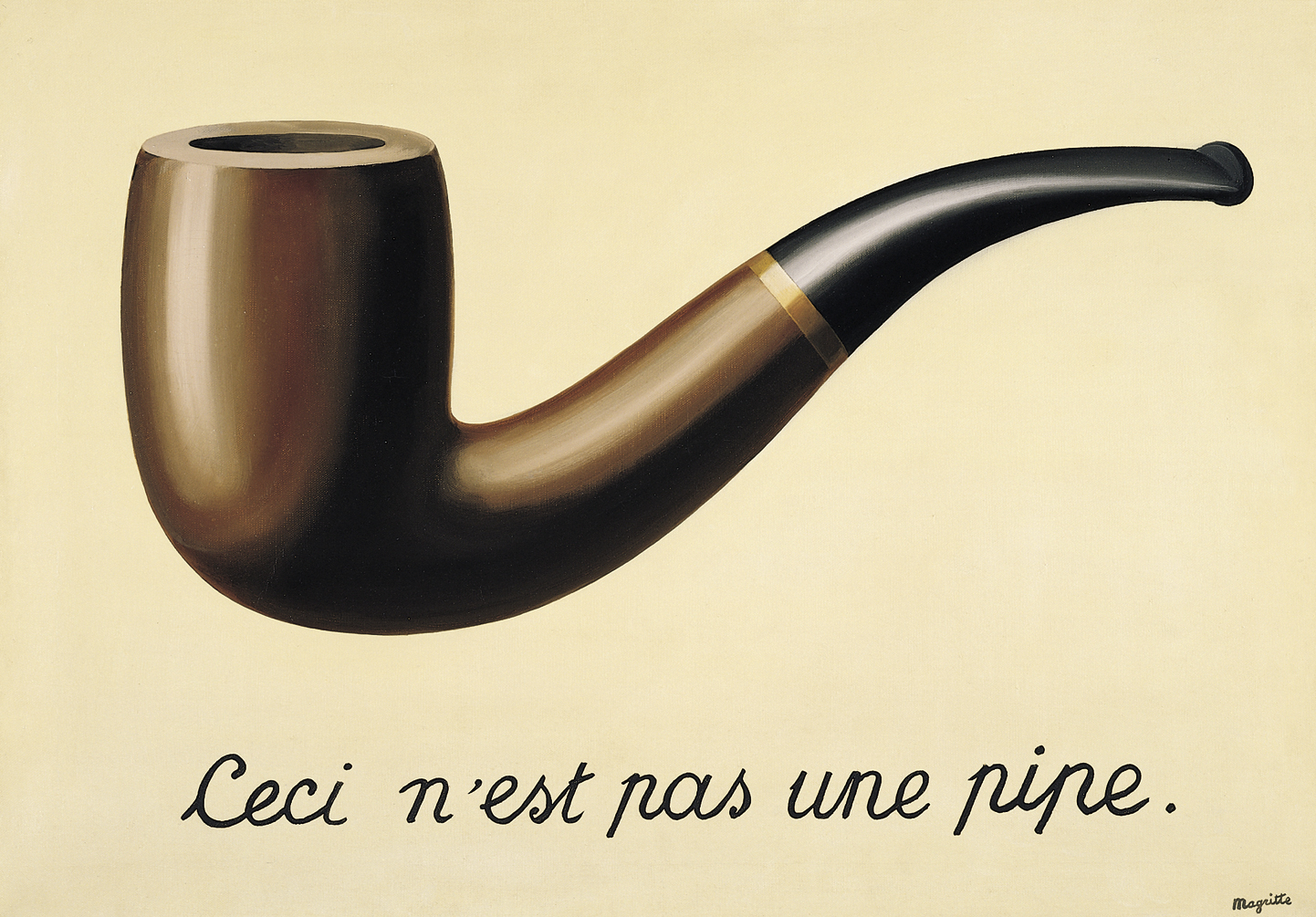
Communication tools are substitutions for primary experience which allow humans to extend knowledge by documenting the world through media. Pablo Picasso once stated that art was a lie that told a greater truth. Jean-Luc Godard, in Le Petit Soldat stated that The cinema is truth 24 frames per second which quickly became twisted into The cinema is a lie at 24 frames per second. Marshall McLuhan also rightly attributed media structuring human discourse and in many ways constricting a greater understanding of the world. In the ultimate conundrum, René Magritte in his painting The Treachery of Images which had an image of a pipe with text underneath it stating Ceci n’est pas une pipe, or This is not a pipe beautifully articulated the tension between secondary representation and primary experience. Media are essentially syntactic structural metaphors that point back to primary experience through semantic ideas contained within it.
When is a metaphor appropriate?
When does it become an embellishment?
When does it become cliche or kitsch?
It depends who you ask.
From my perspective, a drop shadow, a glassy reflection, or a brushed metal background or element could be an appropriate language for user interface elements. In other situations they can be considered an embellishment. When a visual effect is used too much without questioning its appropriateness, it can quickly become cliche or kitsch simply because elements call too much attention to themselves and get in the way of intended meaning.
It’s important to note that not all visual metaphors are bad. Rather, it’s the excessive UI adornments of these visual metaphors that many insiders I’ve spoken with find distasteful and inherently confusing. Source
In the case of Apple, using wooden bookshelves as an iconic reference in their bookstore feels cliche and kitschy. While I am sure there are many wooden bookshelves, why does it have to be in an application that is on millions of phones, tablets and laptop computers? Wood, leather, stitching, faux book pages and drop shadows and reflective elements are not extensible as a language to other applications and actually get in the way of using applications. They also become dated and highlight a past period, rather than feeling contemporary.
What are the limits of skeuomorphism? In many website, tablet and smartphone platforms, I have been sensing a move towards abstract graphical user interfaces that rely on color, typography, grids and rules as the main vocabulary accented by arrows and supporting icons. We still have icons, which in many cases need to be supported by textual equivalents. While an envelope is a historical representation of letter, it is a convenient and accepted metaphor for e-mail, which is in itself a representation of mail. So an icon, turns into an index, which then turns into a symbol. The overall effect is that these applications feel more contemporary, streamlined, and focused.
As a good friend of mine, Dave Zihlman stated:
In general, the desktop metaphors have been losing potency as operating systems such as iOS step back from exposing applications and file systems as separate elements. Opening applications, opening files, managing windows all are fading into the past as applications that are specific in tasks, rather than general as tools, become the standard. This task centric world is managed by the “app” with expectations for the app to gather information off the web, perform a task, manage the result, and socially engage a community, all managed within a tidy container. The Macintosh interface has slowly morphed towards these notions as typical actions such as save and save as have been confusingly moved toward the iOS paradigm.
As technology becomes more ubiquitous and convergent as more and more of our media is digitally integrated, the use of metaphorical representations will also change. As the internet has become more sophisticated and rich internet applications have become more frequent, a new series of behaviors began to appear : digital objects exhibit certain behaviors such as modals, dynamic expansion, and also trigger a series of events. A move to design patterns as a way of creating standardized libraries is a systems approach to modifying object containers that have:
– graphic representation
– object behavior
– events handling code
– underlying client/server code
These patterns can have infinite strains as the four layers can be modified for customized objects. So the visual will become less important and will be balanced by other sensory interactions that will need to be integrated into Apple’s Human Interface Guidelines:
After all, Apple’s Human Interaction Guidelines (HIG) has never been just about the aesthetics of icon shadows or button alignment, but also about the behavioral aspects of application design in general. A generation ago, especially prior to the ascendency of web design, HIG was far more respected and adhered to both by Apple itself and its developers. Loyal users also noticed deviations and complained. HIG debates on public forums were not uncommon . . . iOS ought to have much better inter-application management and navigation than users fiddling with tiny icons. Source
There has been a move to create digital equivalents to touch and the way physical objects behave in the real analog world called haptics. It’s purpose is to enhance the accuracy of how digital representations of physical objects behave and any tactile feedback to users that these objects may generate. Haptics is a type of communication and could be a variant of skeuomorphism by making iconic representations of touch and physics and doing for the sense of touch what computer graphics does for vision.
Skeuomorphism is a necessary concept to make digital applications more accessible and familiar. However, heavy reliance on visual iconic, indexic or symbolic representations are not enough with contemporary digital platforms. Not taking into account emerging sensorial alternatives or additions to visual graphical user interfaces that create more immersive experiences need to be explored. All sensorial functions speed up understanding, engagement and retention of users in their interactions with digital systems.