I recently received news that IKEA was releasing a smart phone application that would integrate “augmented reality” technology. The company currently releases over 211 million catalogues in the United States and estimates that they have about a two-week shelf life before being tossed into the recycling bin. Source
Of course being an advocate for IKEA I downloaded the new smartphone app developed in conjunction with the advertising agency McCann. It is interesting to understand how brick and mortar stores approach to anything digital and especially mobile technology.
From my interactions with different iterations of the Ikea website over the years, it has been functionality poor and does not provide a convenient way to transact purchasing, as it has, and continues to be only an online showroom before one visits an IKEA store. They only just recently added inventory figures for a particular SKU by store. I am not sure why IKEA has refrained from embracing a more transactional process to search, view and purchase items that can either be shipped or picked up at a local store. My intuition tells me that possibly much of IKEA sales occurs through impulse purchasing on the showroom floor, rather than disciplined and narrow purchasing decisions.
Now augmented reality conjures up the ability to use a screen and view information that overlays on objects that are being viewed through the screen which provides deeper information in a dynamic fashion. Augmented reality essentially positions information on top of the visual world to provide deeper information that is associated with an object.
I downloaded the application from the iTunes store and when I opened up the application I had three choices : Store, Scan, and Info with the Ikea catalog in the center of the screen. There was no orientation overlay (missed mobile training opportunity?) so I had to dive in to determine how to use the app through a trial-and-error process.
I pressed the catalog cover and was warned that a 56MB file had to be downloaded first before I could interact with the app. I then immediately went to look up a nearby store, but could not save it as a favorite or primary store (first mistake). I then went to help, and there was a basic illustration of a smart phone with 12 dots at the bottom of the screen that you need to manually scroll through to find content (second mistake).
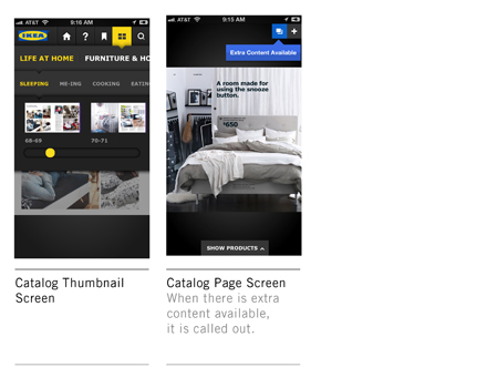
When the catalog opens, it is the printed catalog with thumbnail pages. You can pinch the screen to see a larger image, but it did not work in the front end of the catalog initially. Magnification to an individual item has no direct links to an item detail page (which would have been a convenient alternative to having to drill down with traditional navigation).
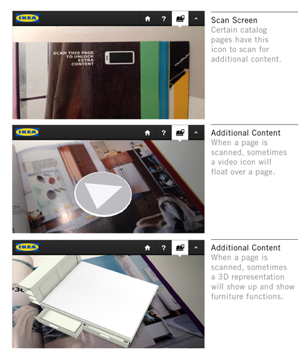
I decided to go to the IKEA store to get the catalog as you need it to scan particular pages that have a horizontal smart phone icon that you aim your camera at and press “scan.” It then calls up the appropriate digital files such as:
• videos
• slide shows
• interactive 3D models of specific furniture
The problem with these additional “value added” assets is that the slide shows are static and do not link to a product detail page. The 3D models, while intriguing, appear and disappear depending on how you hold your camera in relation to the image that is pulling the file.
If there is additional content a blue arrow appears at the top of the screen (which was a commercial and the same one regardless of page a user was on) and also “show products” at the bottom of the page that highlights individual SKUs. Five icons appear, home, help, bookmark, sections and search. These buttons are not persistent at all times when a user is in the catalog and the color contrasts of neutral state were very hard to read. The lists of choices had to be scrolled horizontally which is a very long scroll vs. a simple drop down with all choices at a glance.
Overall, the IKEA Augmented Reality smart phone app is a cross between a marketing gimmick and a promising idea. In its present iteration it does not really know what it is, but it is not really an augmented reality app. From my perspective in order for it to be one, it would have to:
• allow the user to aim the camera and get additional information on a number of objects by pressing on an object on the screen, not pulling files that have no clear call to action
• have a much more robust data model to support augmented information on objects
• should work at the store environment, and not just pointing at a static catalog
• aggregate other users experiences on the same page and link to social platforms
• possibly have popularity of each item that is within a page
A few days ago IKEA sent an email about a targeted holiday campaign for the holiday season. When I visited the campaign page, it had a series of objects with “+” signs next to them that bubbled up information that connected to an item detail page. This is the type of experience that should have been integrated into the augmented reality app.
IKEA does have a few other smart phone apps that continue to try to connect IKEA products to visualizing these products in a person’s home like IKEA Now, and IDEA SmartList Pro.
While Advertising Agencies may have some interesting ideas, their world view is to be seductive, derivative, and collide half thought-out ideas. It would have been interesting to have an interactive design firm with a strong user experience capability that really understands rich internet applications and responsive design principles.